
A few weeks ago I decided to fix the motion on my blog site.
The website was fine, there was no bugs, nothing broken, it loaded fast and the writing was where it should be. It was just missing the small details that separate something solid from something that feels great.
You know how you can buy a really good piece of meat, a proper steak, and then cook it badly. Nothing is wrong with it. You can still taste that the meat is good quality. But it is not the steak you get from someone who knows what they are doing with a pan. That was my site.
Motion is the part of an user interface you are not meant to notice.
Motion is how a panel opens, how a list arrives, how a card answers when you point at it. Its job is to tell you what just happened and that way you never have to stop and click until you work it out. When motion is missing, every action is a clunky jump.
Using that software feels like rusty machinery, it feels like it is being assembled in front of you instead of responding to you. It's not well oiled, the machine moves but not in a smooth way.
So finally, I did some analysis and focused on implementing 6 things.
1. The post list should arrive as one thing
Scroll down my home page and you hit the index of posts.
Every row used to fade in on its own as it crossed into view, which meant 8 separate events happening at slightly different times depending on how fast you scrolled.
That is not how you should feel reading a list. You read list as a single element, one object, not eight.
Now the rows come in together as a single cascade, with about 50 ms between each one, and the whole thing is settled in under 0.5 sec. It's the same amount of motion, roughly, but it belongs to 1 gesture instead of 8.
The compact cards in the tagged sections got the same treatment. They previously had no entrance at all, which was its own kind of inconsistency.
How it's implemented, the list and the row are two components, and Motion passes the animation state down from parent component to child component on its own.
So the list only has to say how much time to leave between rows, and each row only has to say what its own movement is. No row knows its own position in the list, which is what keeps it correct when the list gets filtered or reordered.
// the list owns the interval
shown: { transition: { staggerChildren: 0.05 } }

// the row owns only its own movement
hidden: { opacity: 0, y: 8 },
shown:  { opacity: 1, y: 0, transition: { duration: 0.24, ease: EASE } },
2. The search dialog
Previously, my search command dialog used to just appear.
No transition in, no transition out, and pressing escape made it vanish instantly.
Now it scales up from 96% and fades, the backdrop darkens slightly faster than the panel arrives so human eye follows the panel, and closing runs faster than opening.
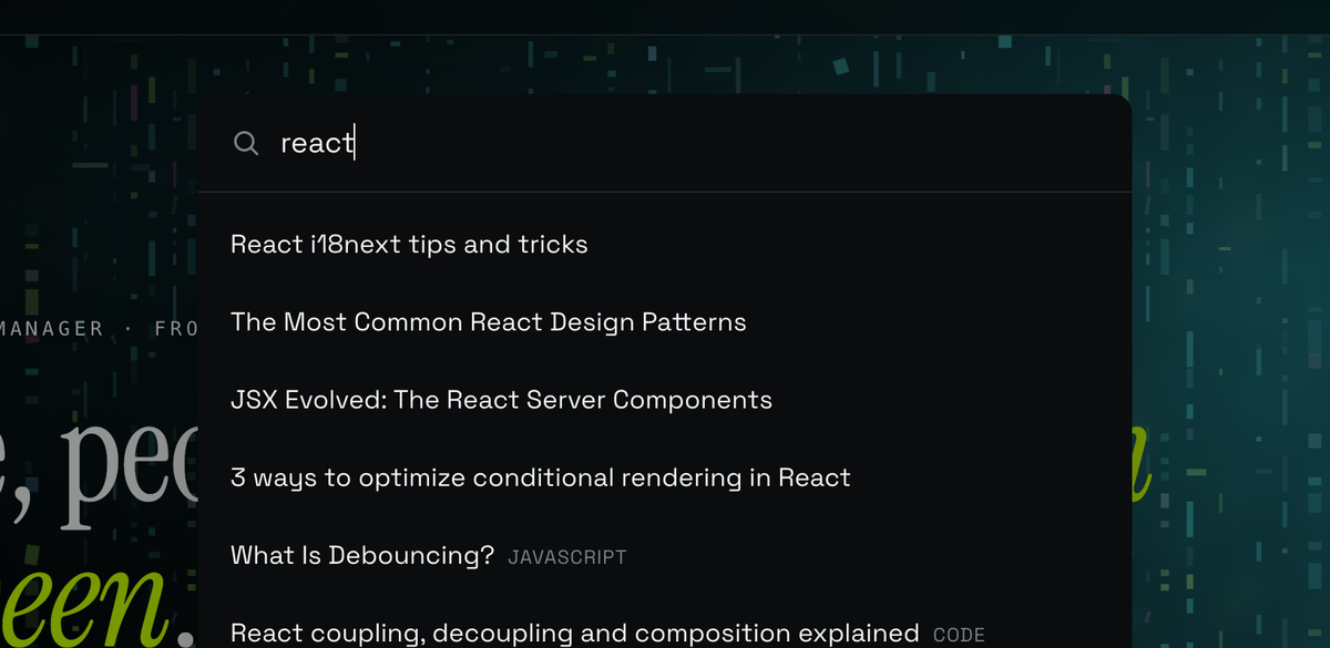
AnimatePresence is the piece that makes closing possible at all.
Without it, React removes the dialog from the tree immediately and there is nothing left to animate, which is why it used to just vanish.
It scales from 0.96 rather than from 0, and it exits at a smaller distance and a shorter duration than it enters.
initial={{ opacity: 0, scale: 0.96 }}
animate={{ opacity: 1, scale: 1 }}
exit={{ opacity: 0, scale: 0.98 }}
Two things I fixed while I was in there that were not really about animation:
clicking outside the dialog never actually closed it, because the backdrop was trapped inside the header and was not covering the screen at all.
focus now moves into the input when it opens and back to the search button when it closes, so it works properly if you never touch the mouse.
3. The header gets out of the way
The header sits on top of everything and it is always visible. That is correct when you arrive and slightly annoying when you are reading.
Now it shrinks a little when you scroll down and comes back to full size when you scroll up. Nothing dramatic, about 6% smaller and tucked up a few pixels.
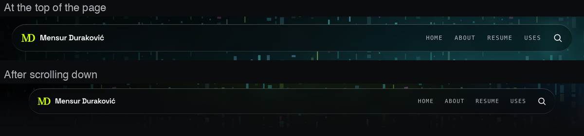
While implementing this I decided that the scroll position drives a motion value instead of React state.
That's because putting scroll position in state re-renders the whole header on every scroll event, and this way nothing re-renders at all. So I decided, that the condensing itself should be a single number between 0 and 1, and that everything else is derived from that single number.
const { scrollY } = useScroll();
const condensed = useMotionValue(0);
const scale = useTransform(condensed, [0, 1], [1, 0.94]);
I also had an issue with flickering as the flicker is not just “wait for a bit of travel before you flip.”
There is a second rule that the header stays expanded near the top of the page, and that rule is a threshold too. A single number is a line you can sit on and keep crossing, so the header keeps flipping.
The top of the page has to be a limit: you condense after you have gone past one height, and you only expand again after you have come back past a lower one.
if (v < EXPAND_BELOW) {
  next = false; // 64
}
else if (travel > HYSTERESIS && v > CONDENSE_ABOVE) {
  next = true; // 14, 128
}
else if (travel < -HYSTERESIS) {
  next = false;
}
Other constraint was that it must not push the page around while it does this, so nothing actually resizes. Now, the whole header pill scales, which is a visual change and not a layout one, and the space it occupies stays the same.
4. Knowing how far into an article you are
My articles are sometimes long and some of them are extremely long.
When reading, there was nothing telling you how much was left, and on a phone that is important, because the scrollbar is either invisible or lying to you because of the footer.
So now there is a thin 2px line at the top of the page now that fills slowly as you read.

It works with useScroll which can take a target element instead of the document, and that one argument is a difference between a bar that is telling a truth and one that is lying.
The offsets say where progress starts and ends so basically 0 when the top of the article meets the top of the screen and 1 when its bottom meets the bottom.
const { scrollYProgress } = useScroll({
  target: articleRef,               // the article, not the page
  offset: ["start start", "end end"],
});

const scaleX = useSpring(scrollYProgress, {
  stiffness: 220,
  damping: 40
});
The spring is only there to smooth the raw value, which is sometimes jumpy when user is using a trackpad. It never leads, so the bar still lands exactly on full when the article ends.
Couple decisions in there that I care about:
It has no percentage and no number, because I do not want you looking at it.
It should only be noticeable if you go looking for it.
Also, it measures the article, not the page, so it reaches the end when the writing ends rather than when the footer ends.
On the post I tested this feature, I put about 500px of footer under the last paragraph, and a bar that was still climbing through that would be lying to the user.
5. Everything hovers the same way
This one is embarrassing a bit.
My cards had grown their hover effects one at a time, whenever I built each component, and they had all ended up different.
I had 3 different image zoom amounts and 3 different speeds. Nobody would consciously notice, but that is exactly the point. You feel it as sloppiness without being able to say why.
Now every card does the same thing, it lifts 2px and the image scales a bit, on the same clock.
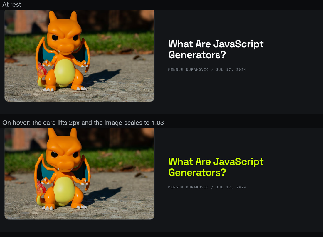
This one is plain CSS, no JavaScript at all and you can achieve it with 2 details to do the work.
The hover rule sits inside a pointer media query, so a phone, where a tap counts as a hover, never leaves a card that is stuck in its hovered state. And :focus-visible is given the same rule as :hover , better than something approximate, so tabbing through the site produces the identical result.
@media (hover: hover) and (pointer: fine) {
  .card-hover:hover { transform: translateY(-2px); }
  .card-hover:hover .card-media { transform: scale(1.03); }
}

.card-hover:focus-visible,
.card-hover:has(:focus-visible) {
  transform: translateY(-2px);
}
The part I am most pleased with is not visible in a screenshot and that's the keyboard focus.
It now gets exactly the same treatment as the mouse. If you tab through the site, the cards respond in the same way when you hover over them.
6. Moving between pages
Clicking a post used to be a default behavior, the index disappears, the article appears, and that's it.
Now the page crossfades, and the image from the card you clicked grows into the image at the top of the article. It is the same picture, so it moves instead of being replaced.
The browser does the animation, not a library. You give the same name to the card image and the article image, and the View Transitions API works out that they are the same thing and moves one into the other.
image.style.viewTransitionName = "post-hero-image"; // the article image has it too

document.startViewTransition(async () => {
  router.push(href);
  await routeHasChanged(href); // push returns before React has finished
});
That last line is the trap. router.push resolves before React has actually rendered the new page, so without waiting you take a snapshot of a page that has not changed yet and the animation does nothing.
This is the one that feels like a real app rather than a website, and it is also the only one where I would understand someone disagreeing with me.
It is the kind of effect that is very good until the day it is annoying. Browsers that do not support it get an instant navigation instead, which is the correct fallback. Same if you have reduced motion turned on, which is true of all 6 of these changes above.
Was it worth it
None of this is a feature and nobody will email me about the header or reading progress indicator.
If I described any one of these to you in a sentence it would sound like a waste of an evening.
But together they are the difference between a site that works and a site that feels like someone thought about these little things.
The writing did not change, the layout did not change, colors also did not change and it is the same steak.
It is just cooked properly now, and you can taste the juices even if you could not tell me what changed.